
Hi! I'm a graphic designer specialising in crafting brand identities and design for print.
MY WORK

Rebranding Termoli

Spice Packaging Design

Climate Change Infographic

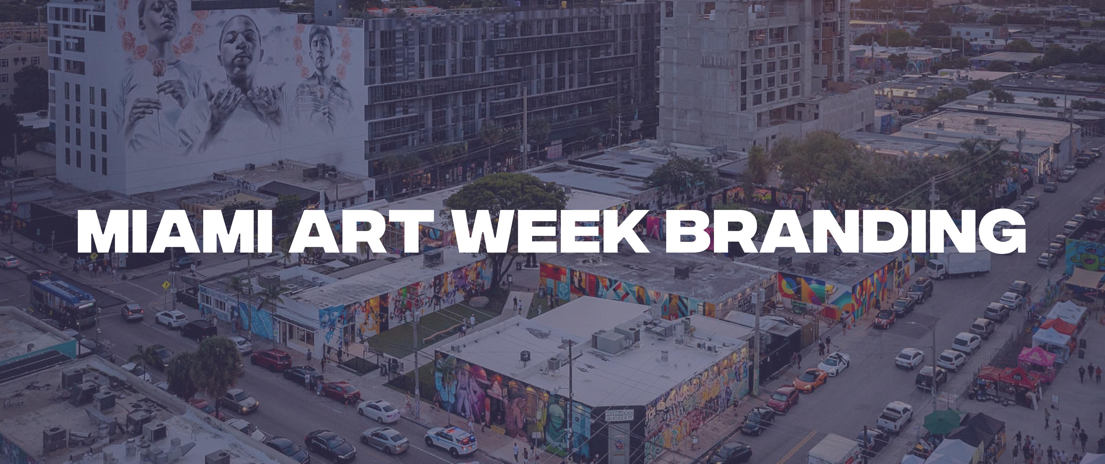
Miami Art Week Branding
GET IN TOUCH
To contact me, send a message to my email:
[email protected]Or you can get in touch by completing the form provided.
ABOUT ME
I’m Ryan Wilson, a graphic designer with a strong interest in branding, infographics and product design. I am currently studying Visual Communication Design at the University of Canberra in my third year. I love to create visually engaging designs that balance creative aesthetics with practicality.
PROJECT OVERVIEW
The task for this university project was to create a concept rebranding for Miami Art Week. Miami Art Week is a major international art event held across the city of Miami through multiple galleries. Miami Art Week attracts artists, brands, and tourists from around the world.The current branding is fairly basic and could use a rework to emphasize its cultural identity and energy of the event while also unifying the multiple galleries and events under one brand.The rebrand should reflect Miami’s cultural vibrancy, diversity, and creative scene while being flexible to work across different digital platforms, event signage, wayfinding, and event marketing.
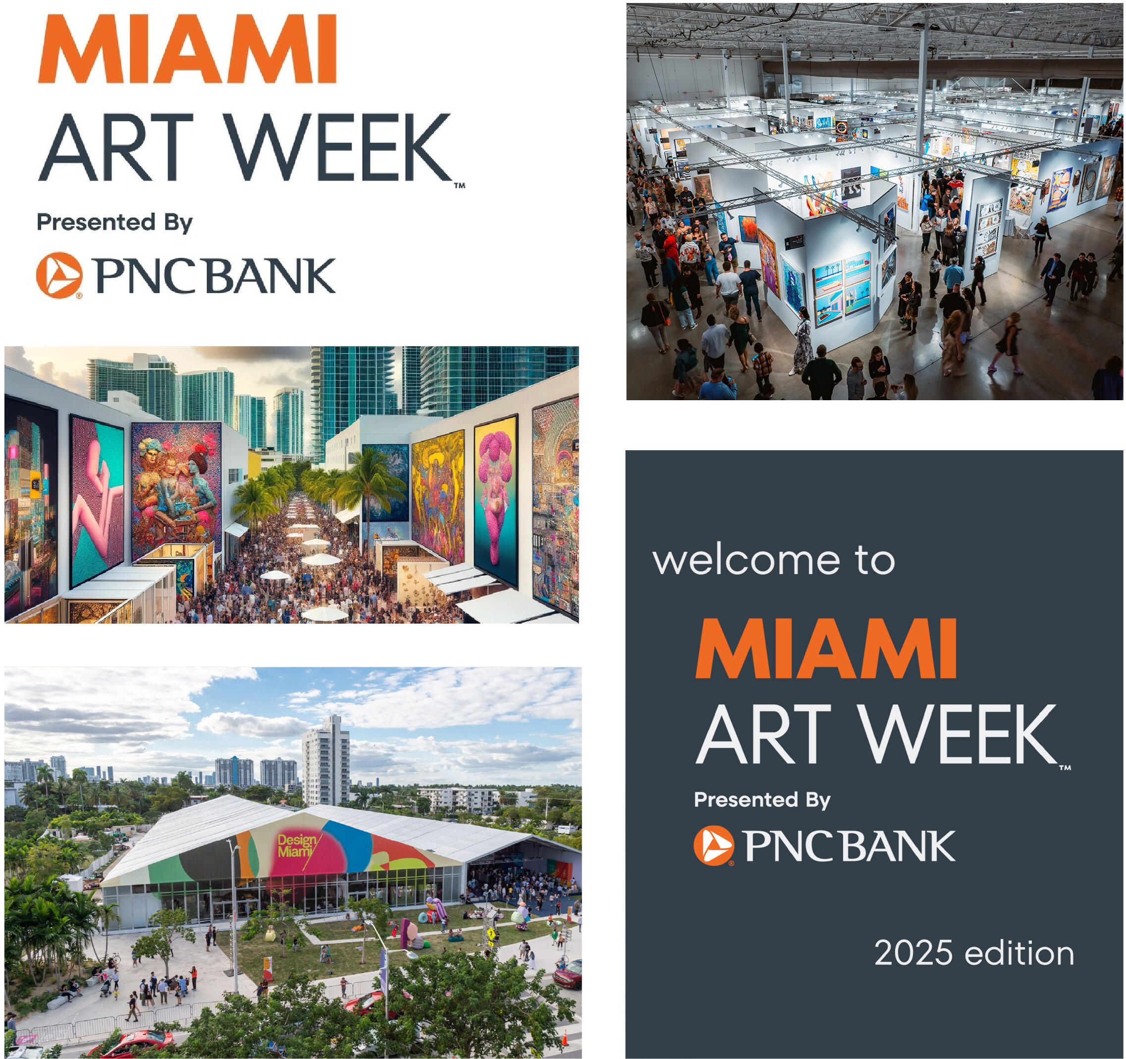

THE LOGO
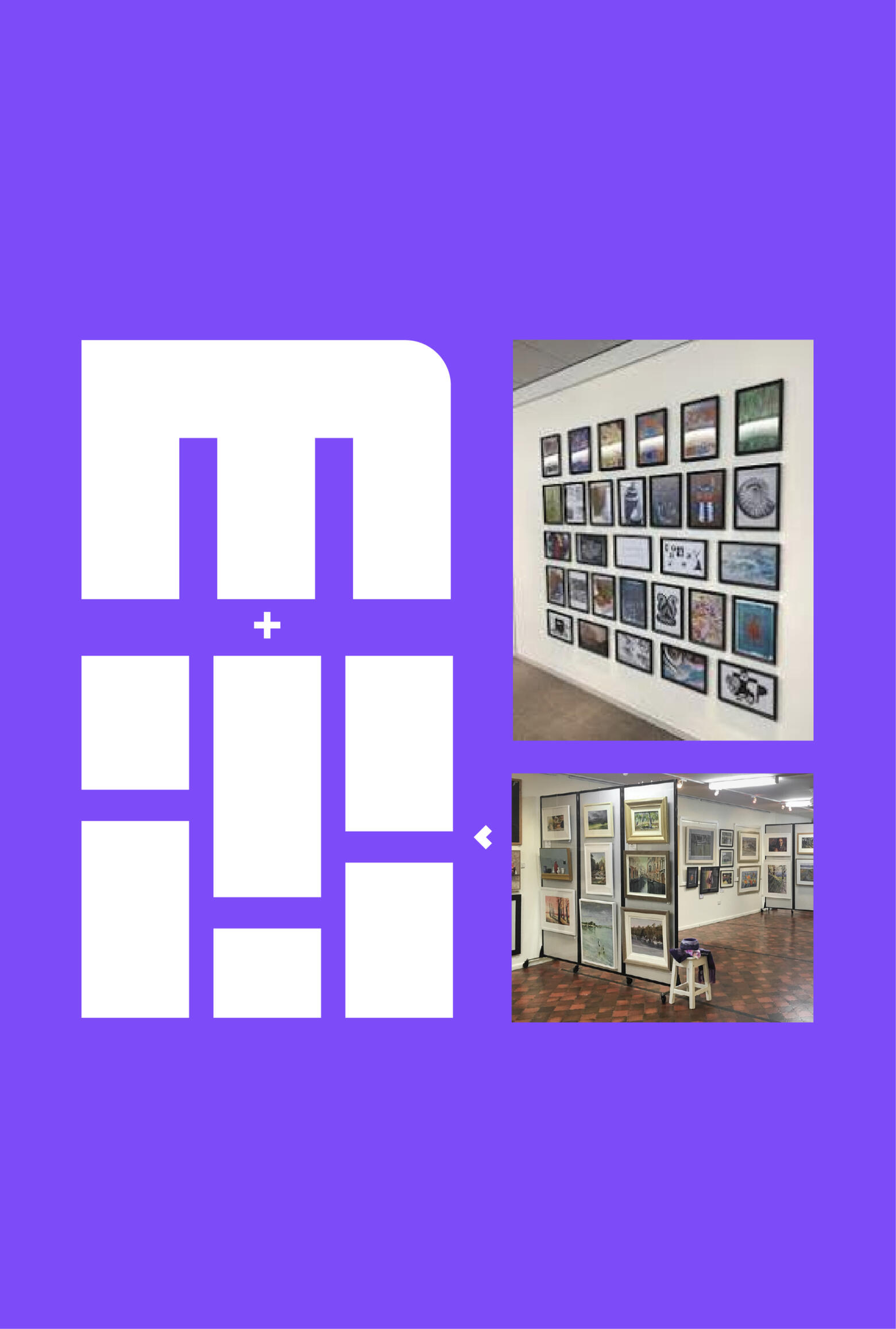
This logo was inspired by art gallery displays creating a blocky pattern. This pattern was designed to form the letter 'M'. It has a bold impactful style suitable for conveying the energy and excitement of Miami Art week.
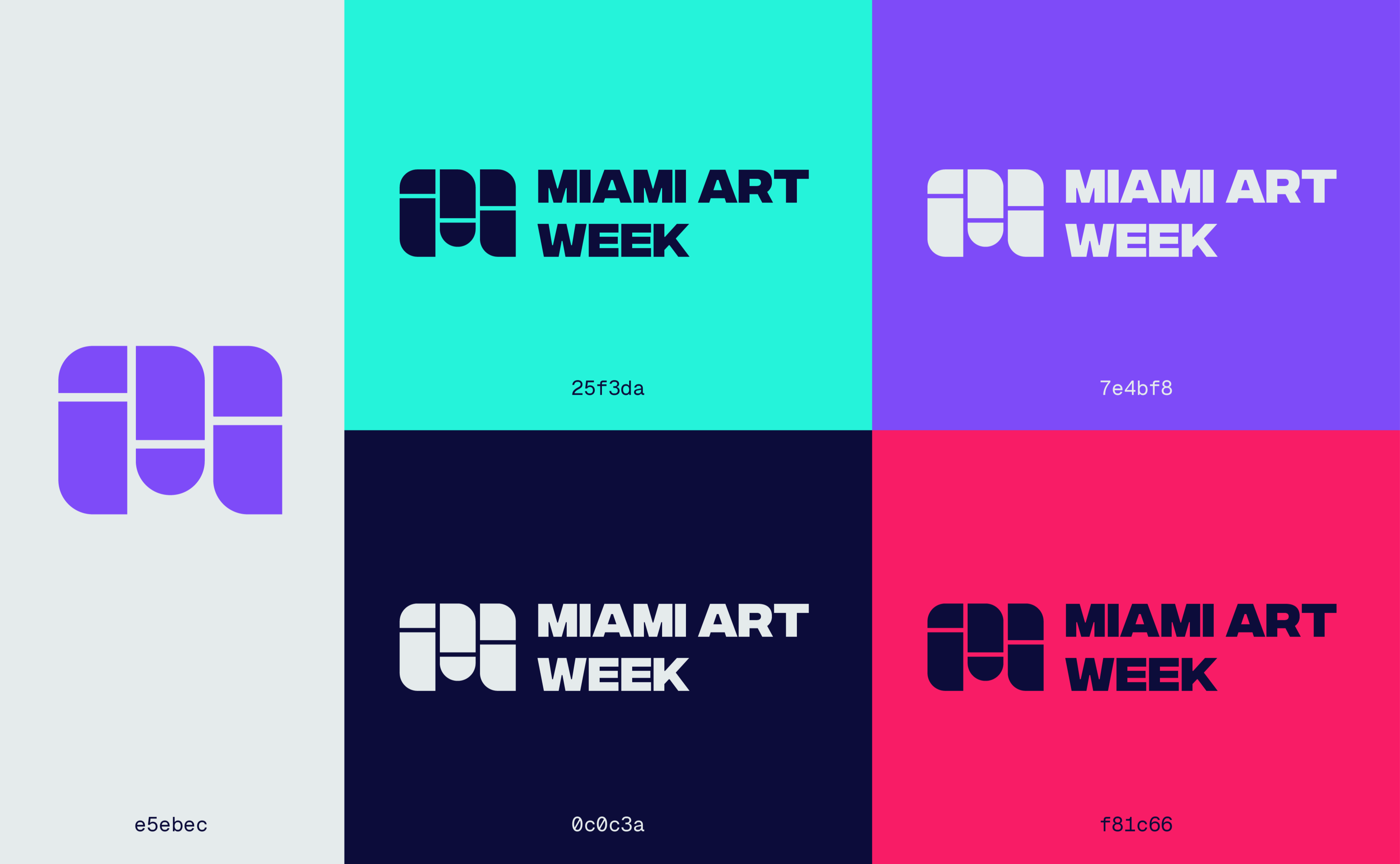
COLOURS
TYPOGRAPHY
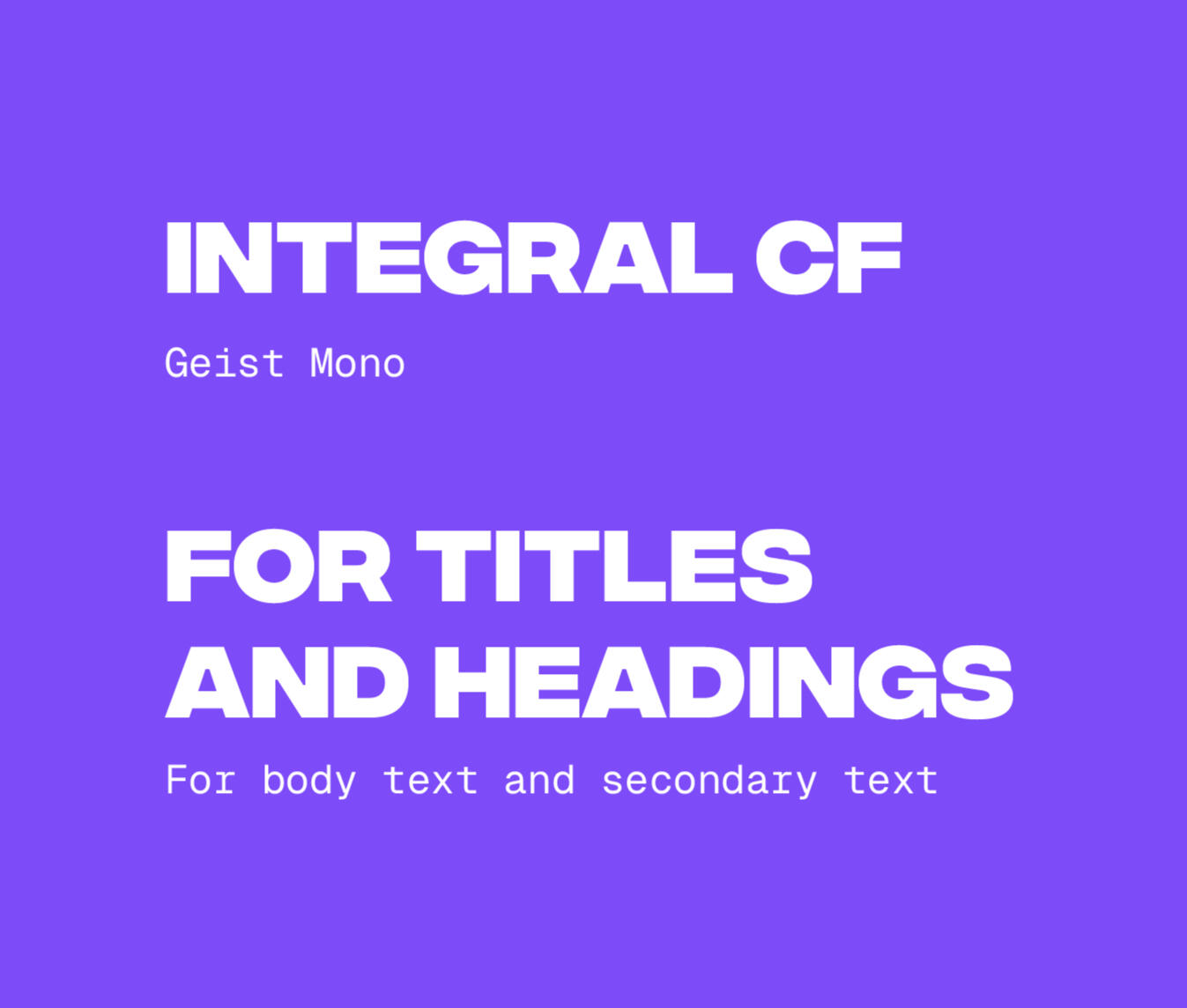
Integral CF is used for the primary font because it is bold and similar in style and energy to the logo. Geist Mono is a light slab serif font that contrasts from the primary font creating a clear and readable hierarchy.
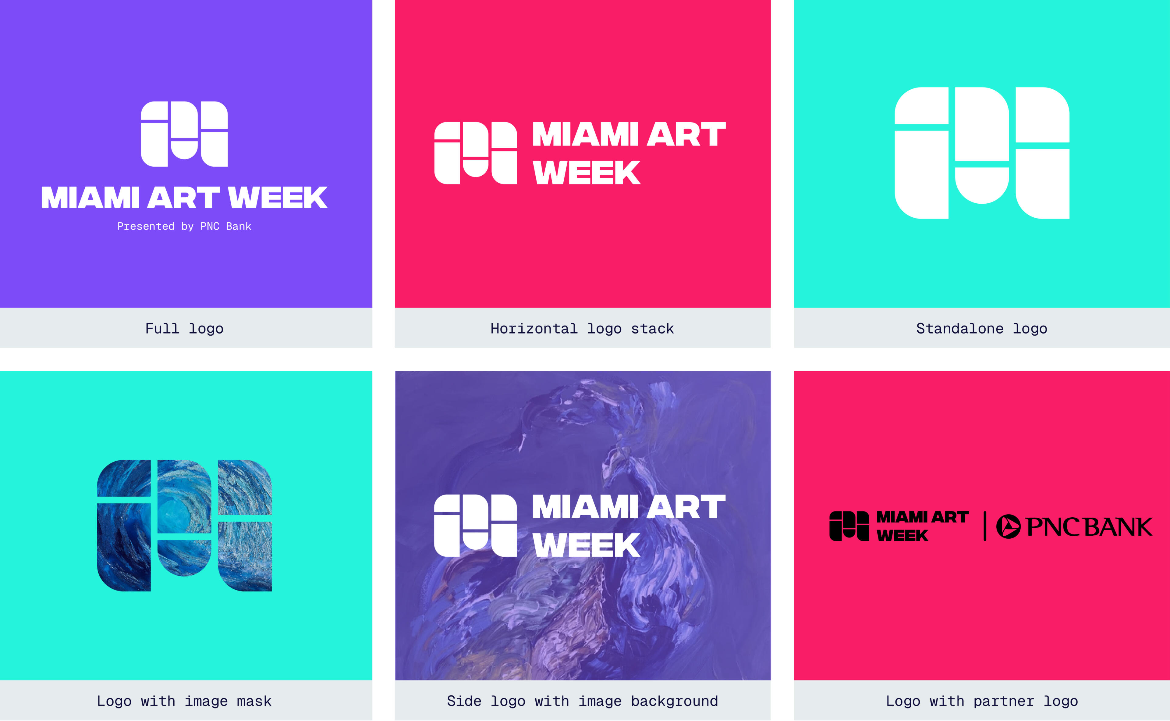
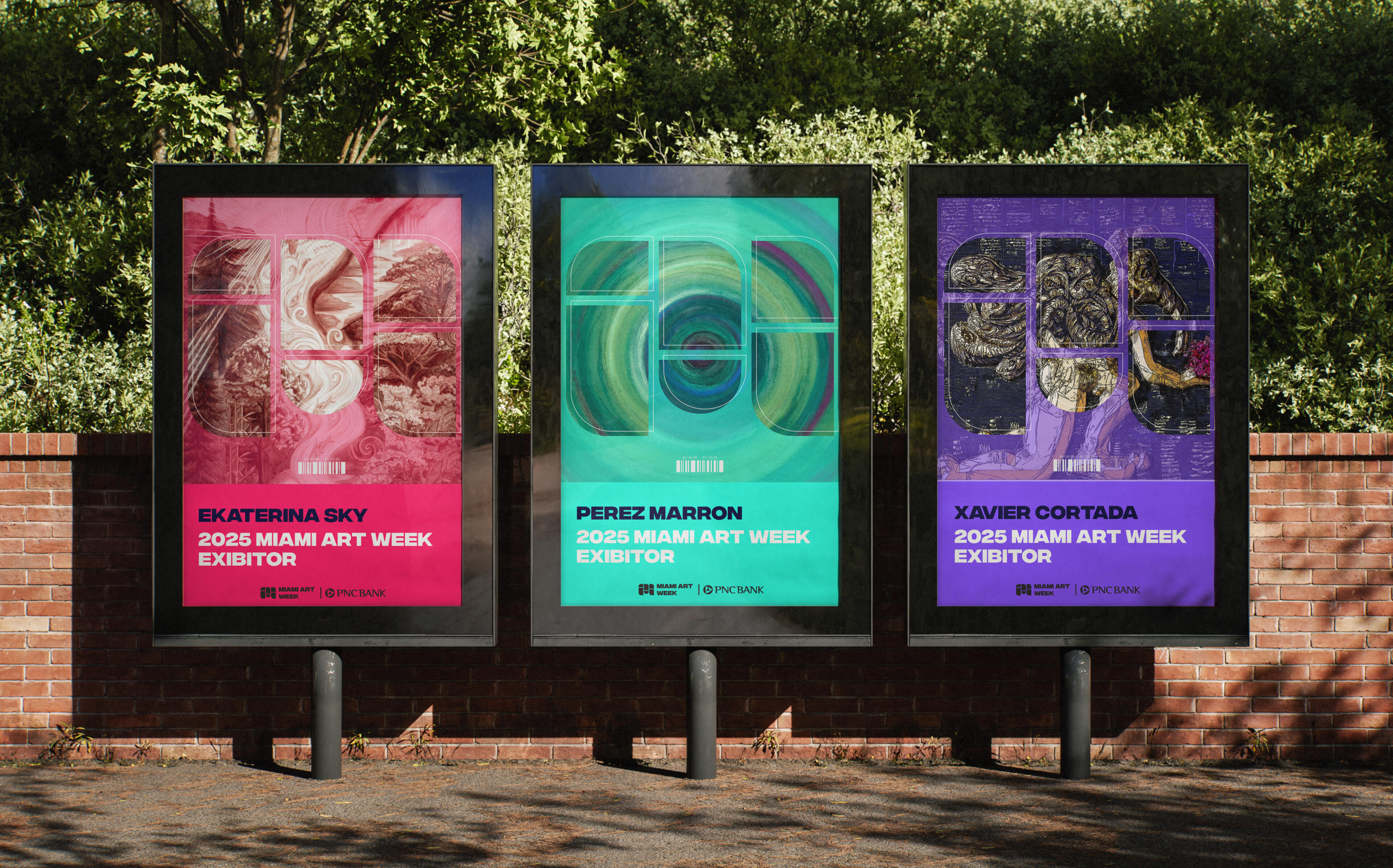
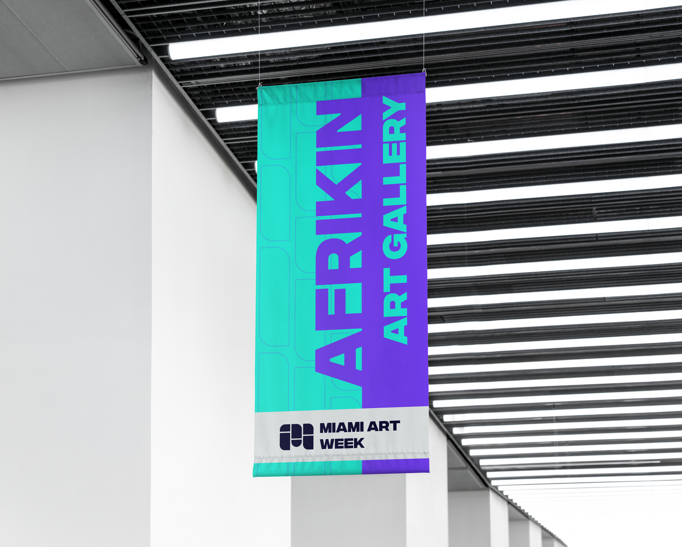
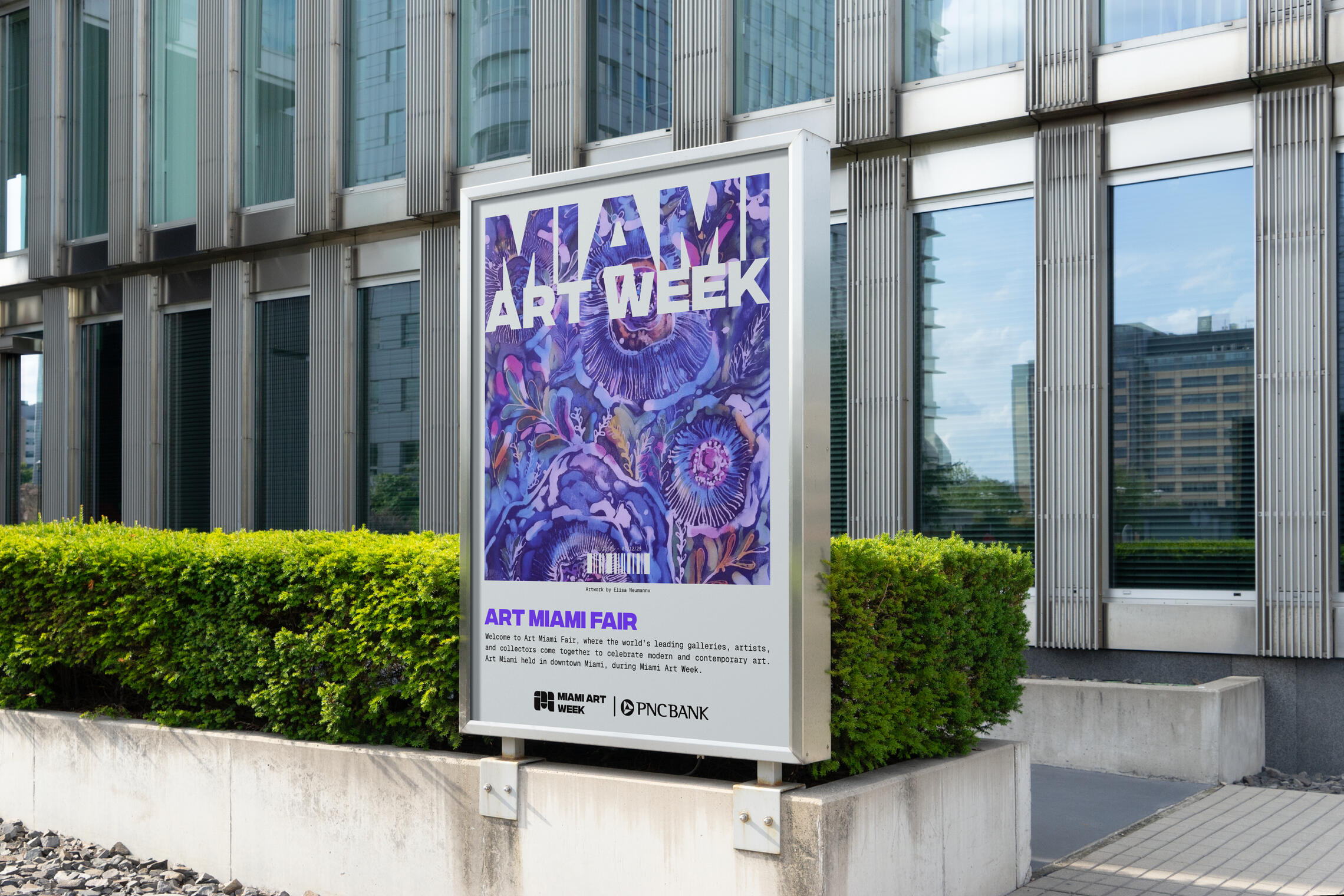
LOGO VARIATIONS + APPLICATIONS
MOCKUPS
PROJECT OVERVIEW
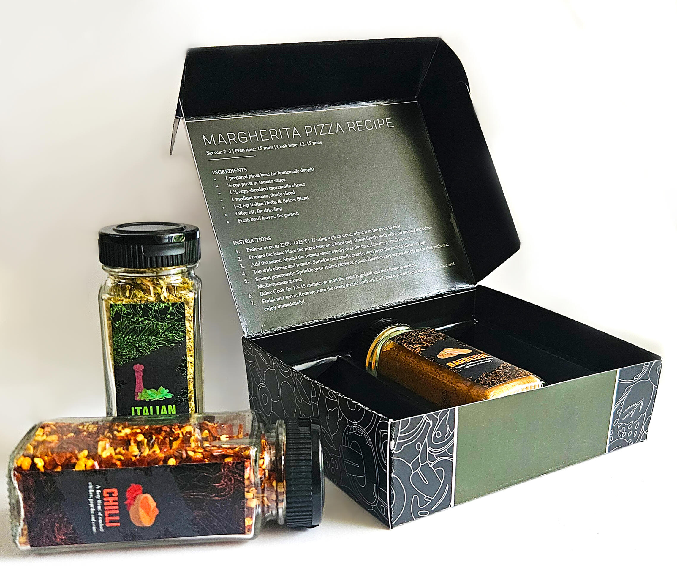
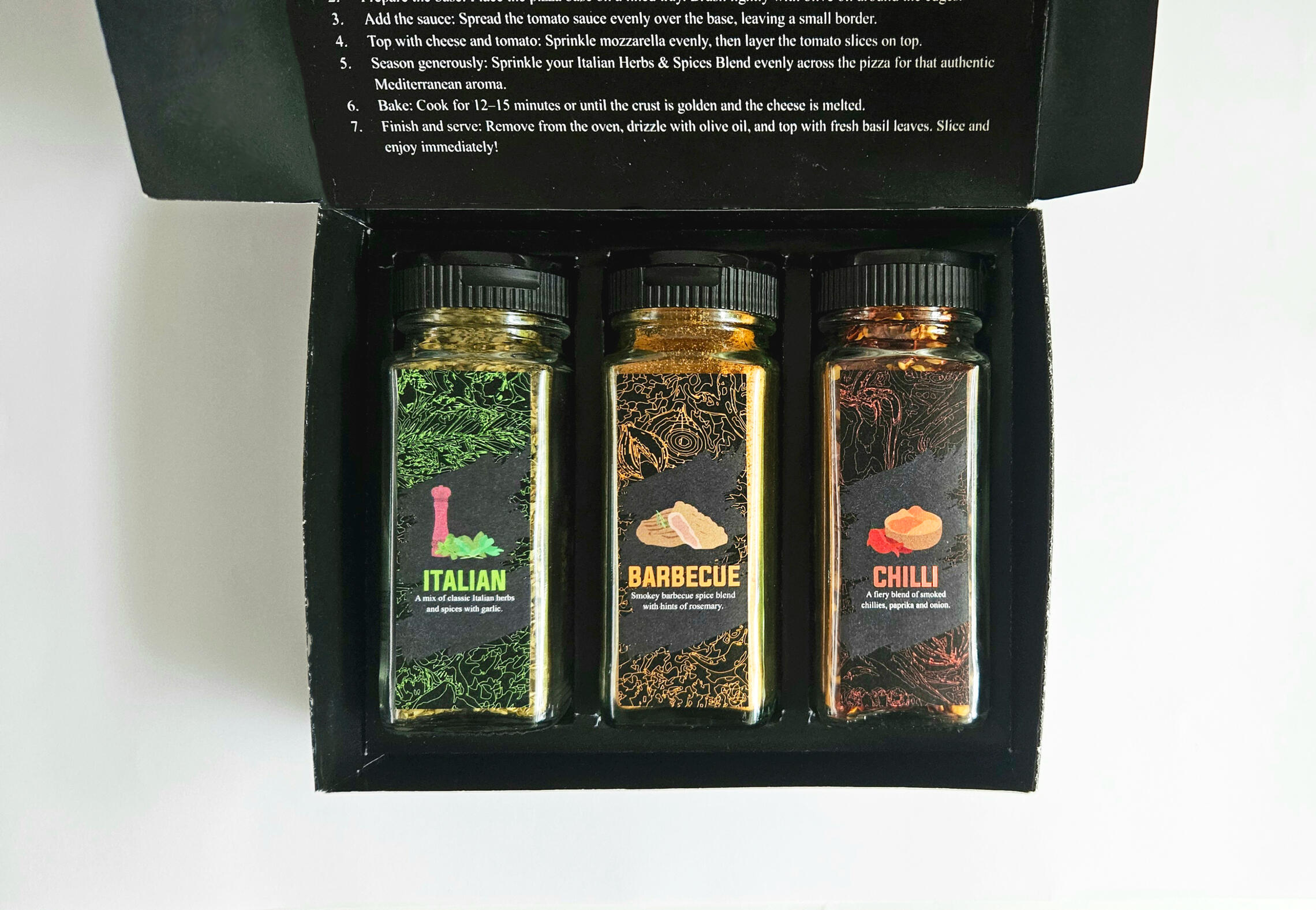
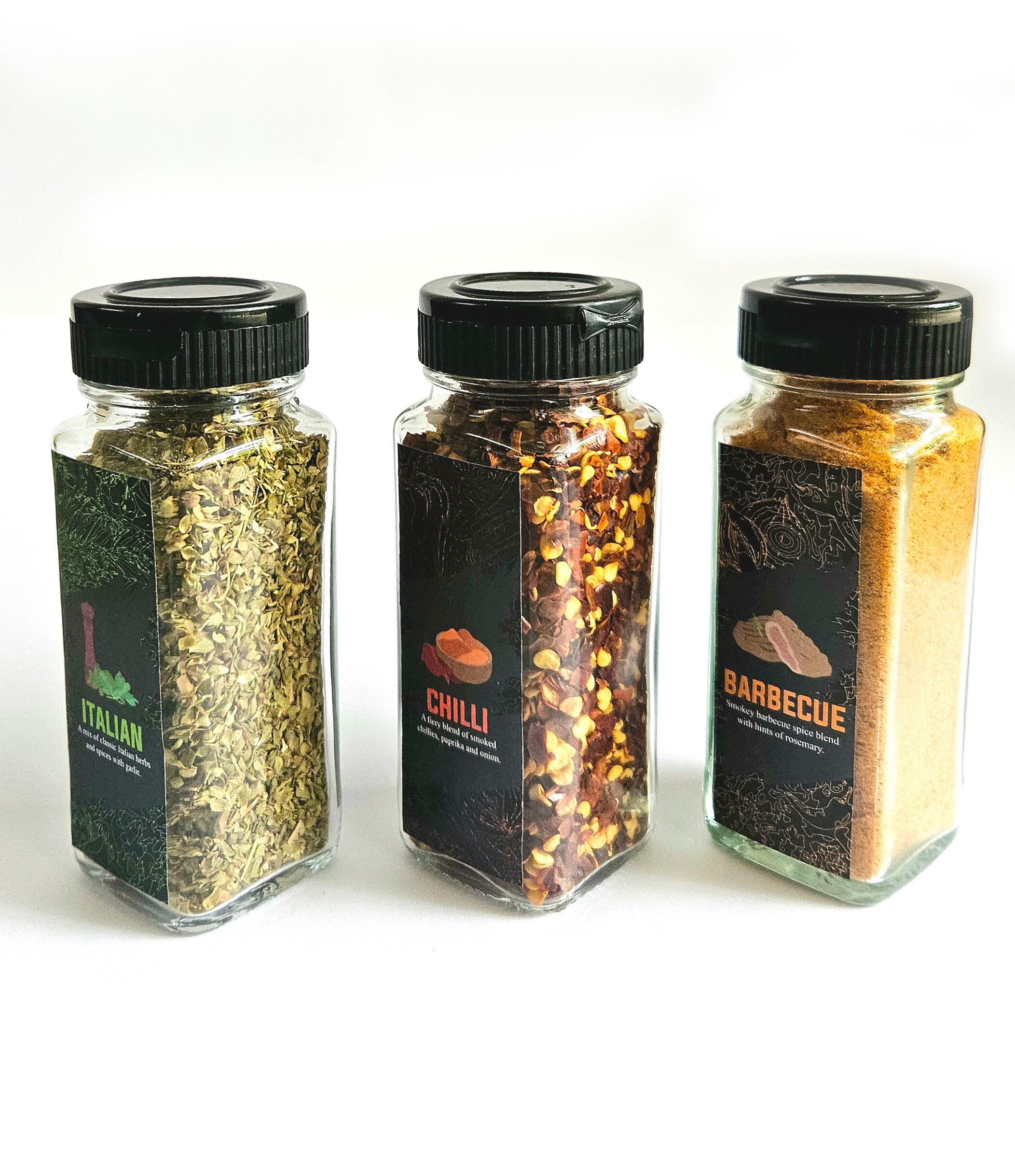
The task for this project was to design a concept for the primary and secondary packaging of a commercial product to be sold at supermarkets. This design was to be printed and constructed physically. The focus was on creating a strong visual design and marketing the product effectively to the desired target audience.I chose spice packaging created specifically for pizzas as my product. The target audience was food enthusiasts that enjoy products that feel authentic, and carefully crafted.
LABEL DESIGN
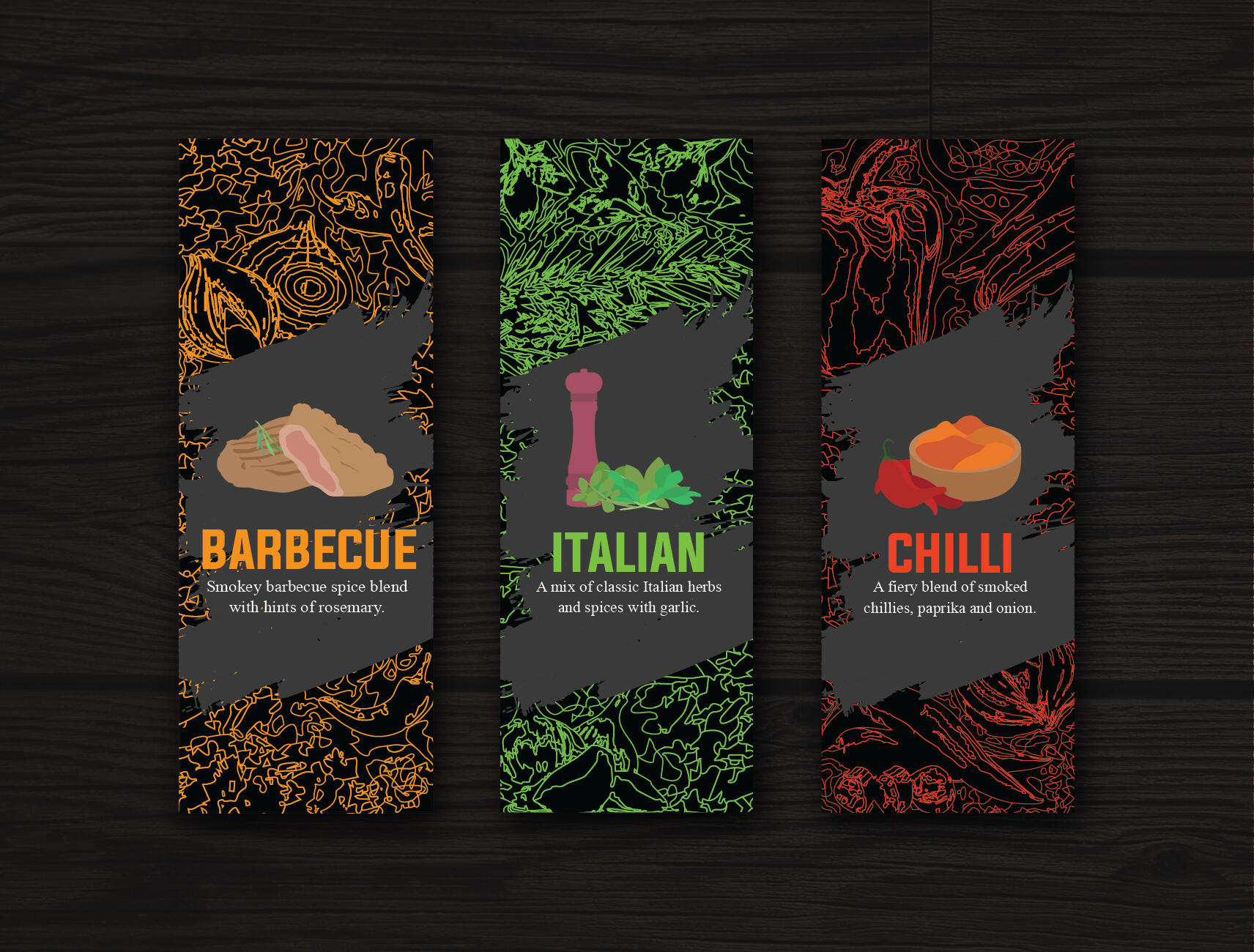
The spice bottle labels were designed using a dark colour scheme to convey sophistication and exclusivity. The background uses a stylised effect inspired by the pattern of contour lines.The background uses a brush stroke style pattern to communicate the artesian and handcrafted quality of the product. These design choices help position the brand toward a high end market.
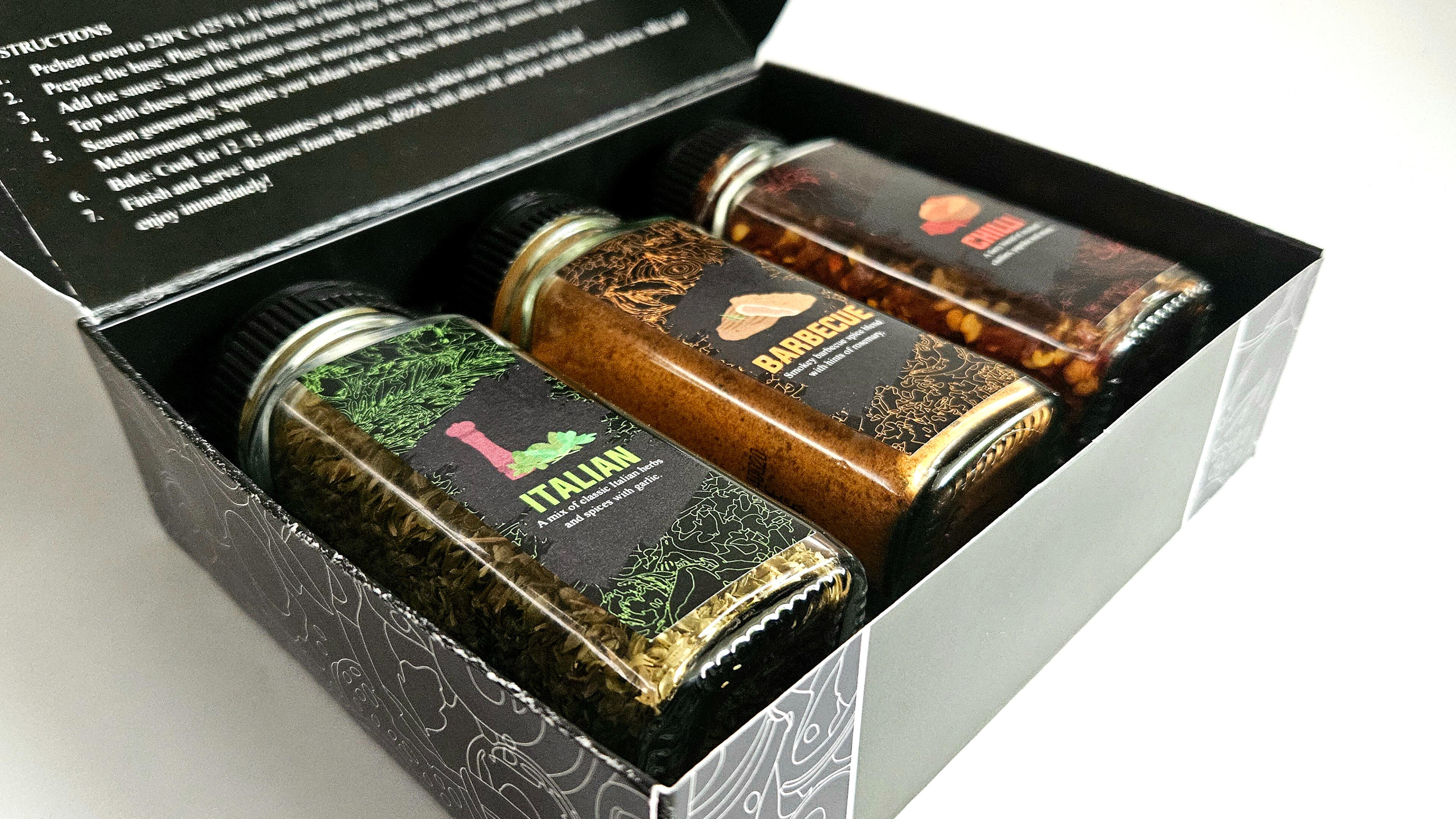
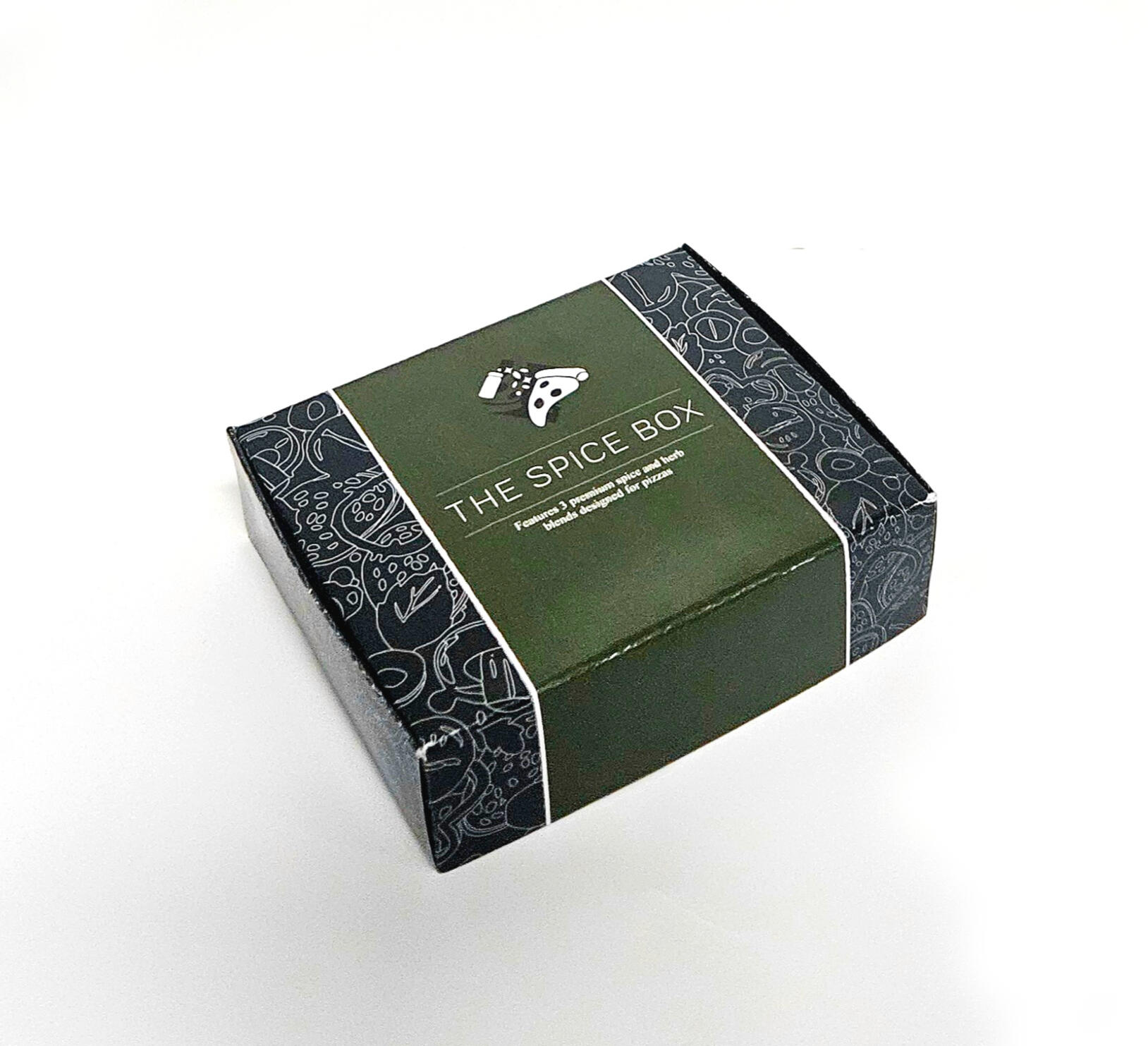
BOX DESIGN
The box uses black for the background with a dark olive green to pair with it, making it visually cohesive with the spice label designs. It applies the same background pattern style as the labels creating a premium minimalist style without looking too basic.
PROJECT BRIEF
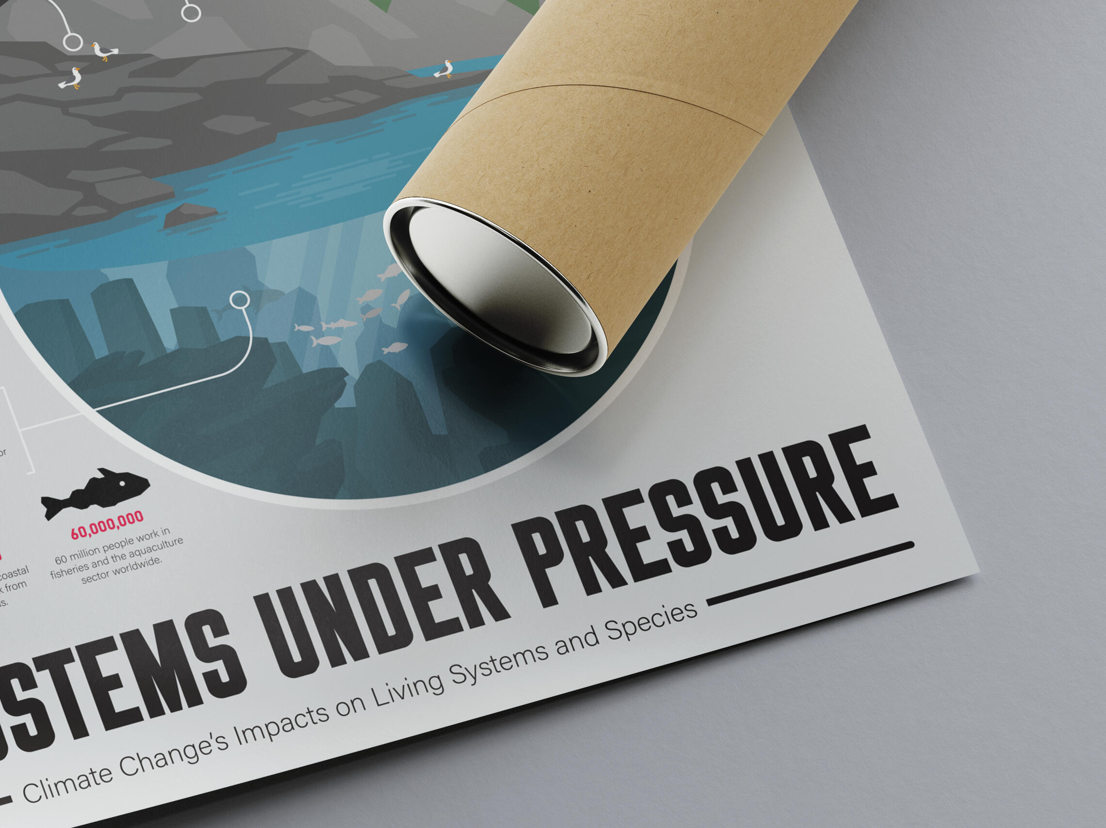
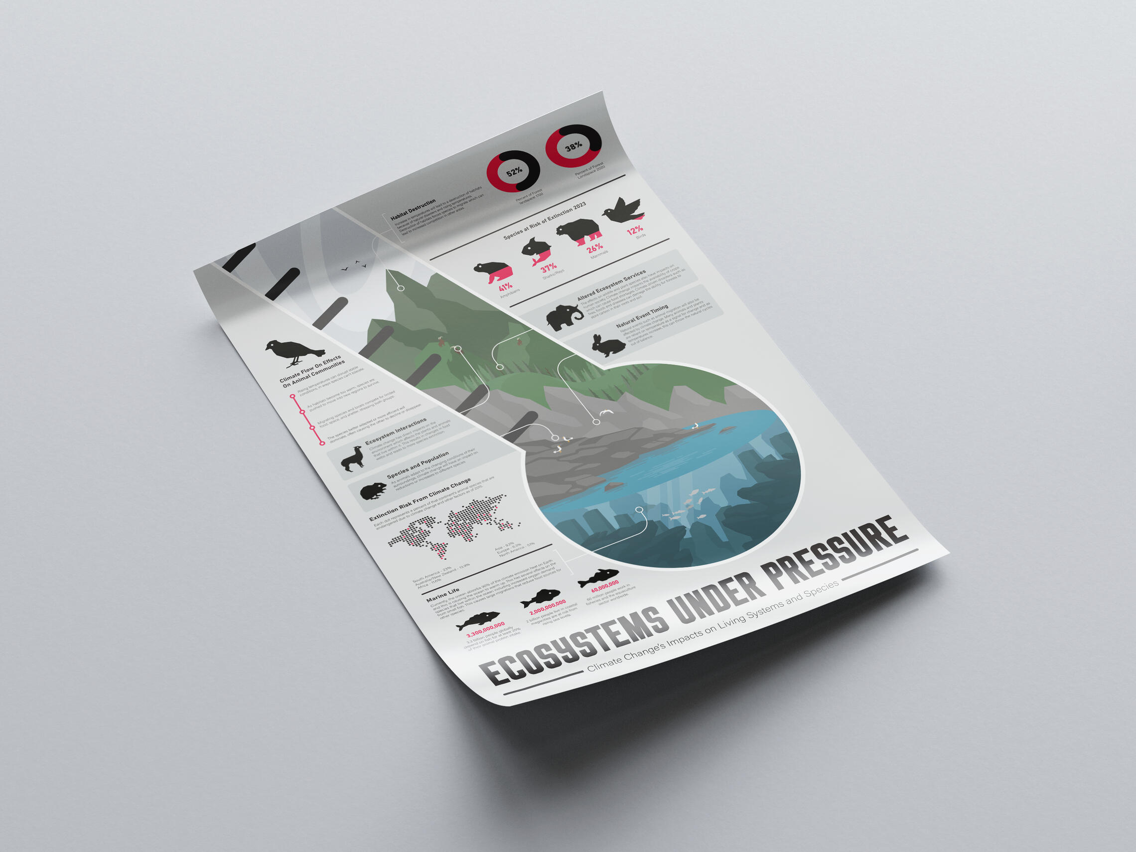
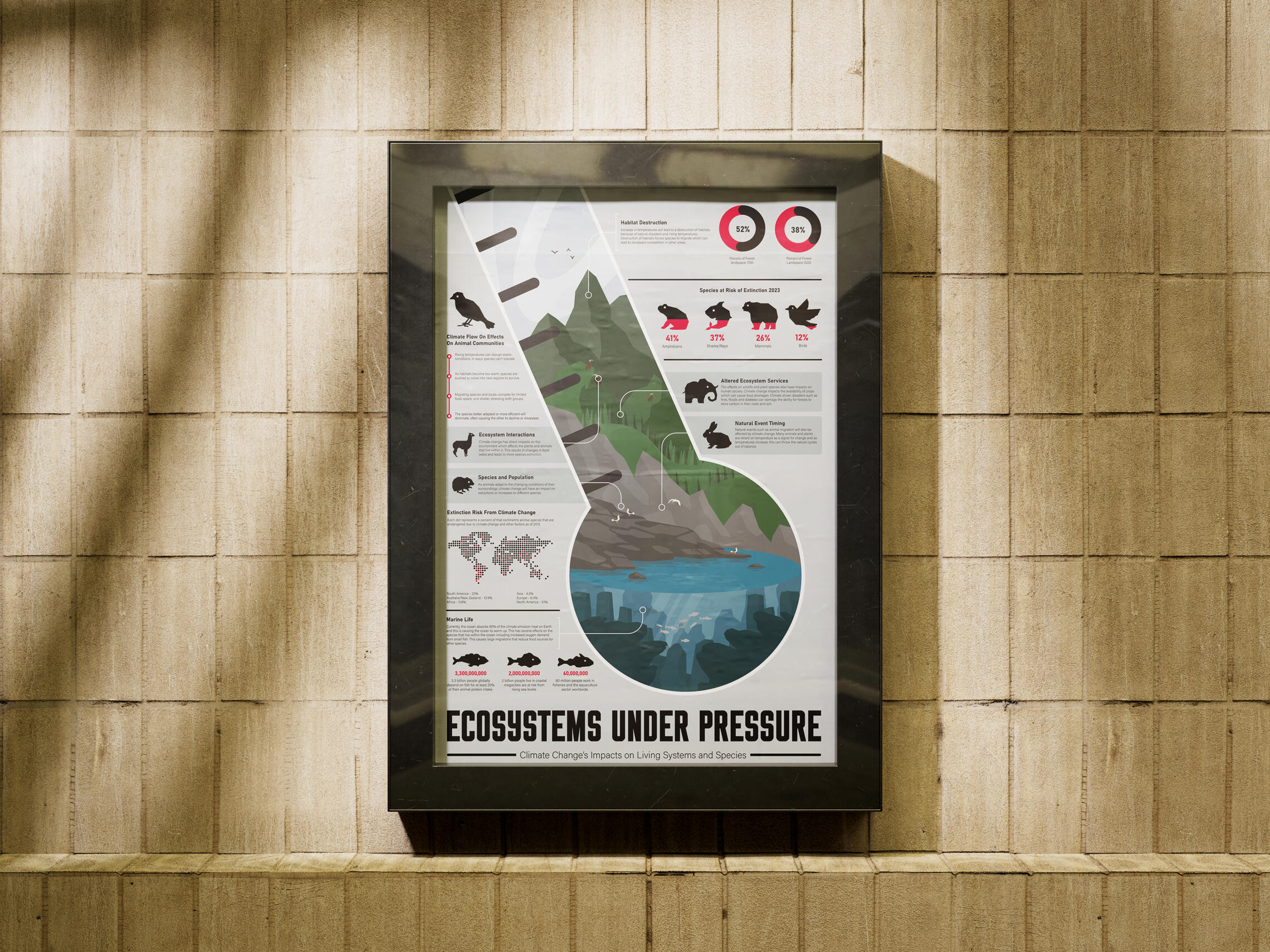
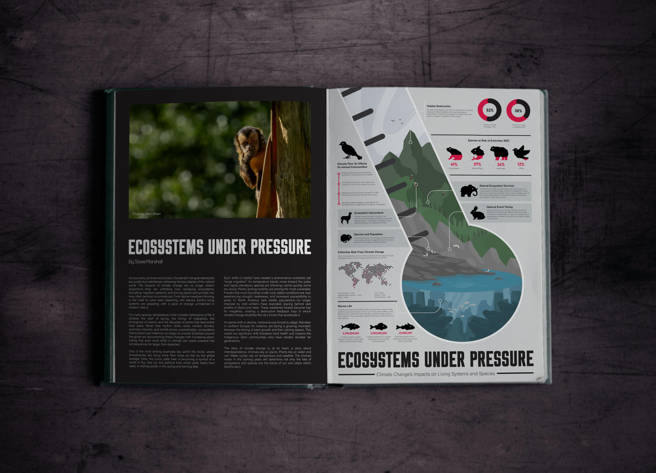
The task for this project was to create an infographic on one aspect of climate change. This infographic was to be designed in A2 size to be printed out as a poster for the university. The infographic should clearly translate complex information into an accessible visual narrative, helping viewers quickly understand issues, causes and impacts of the chosen topic. I chose to create my infographic on the impact climate change has on ecosystems and wildlife.
ICONOGRAPHY
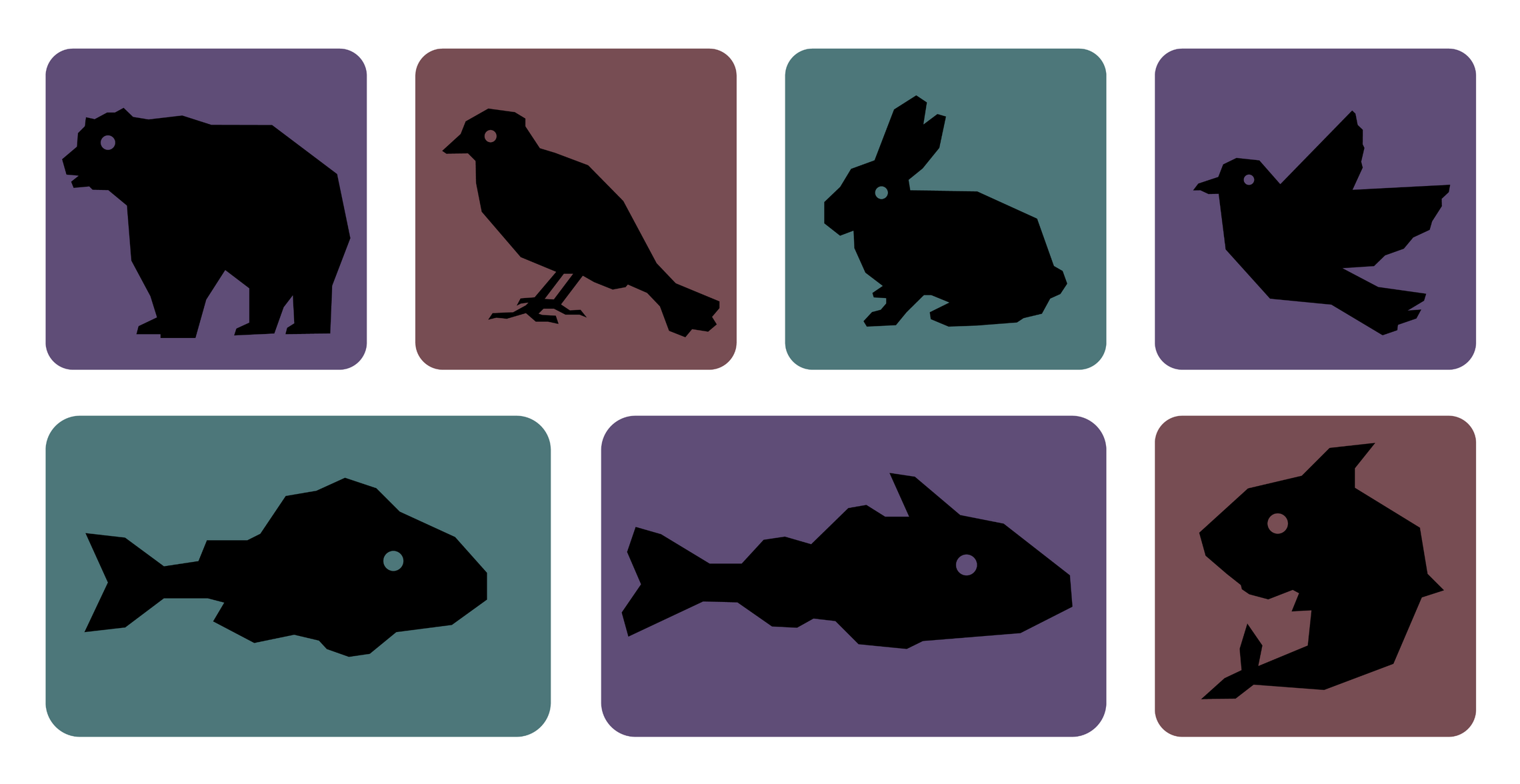
The infographic uses a style of simple blocky icons of animals making them clear. In some areas they were used as information displays showing how much that type of species is at risk from extinction. The icons were also used to balance out the amount of text in some areas making it less overwhelming.
LAYOUT AND DESIGN
The infographic features a large thermometer filled with a landscape referencing the consequences rising temperatures has on the environment. This thermometer is the core of the design and helps the information flow down the page. A variety of icons and visual graphics to make the information quick and easy to process while also balancing the large areas of text. Red was used as the accent colour which stands out from the pastel colours and conveys a sense of urgency and importance.
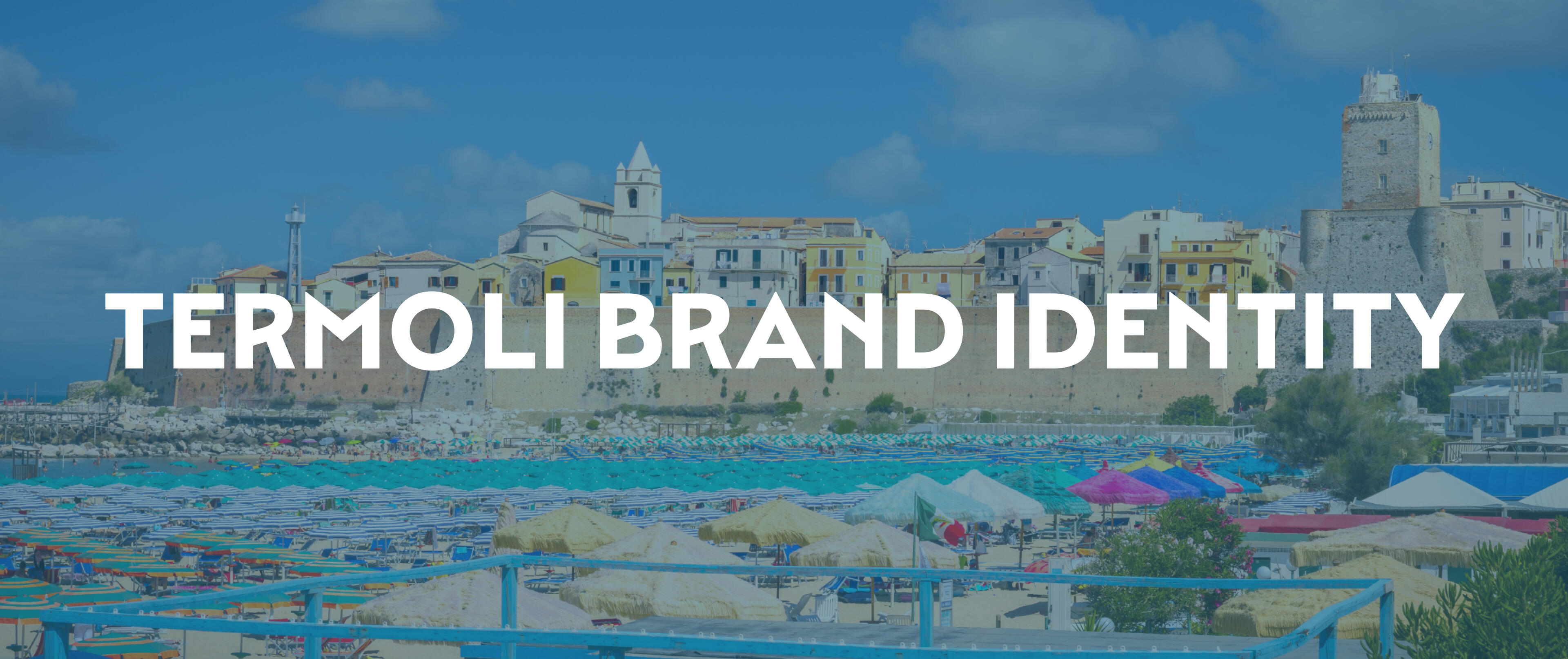
PROJECT OVERVIEW
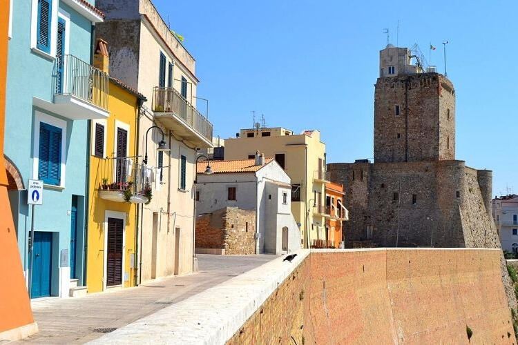
This task was a university project based on the rebranding Termoli competition by TerraViva. Termoli is a historic coastal town in southern Italy that is known for its Adriatic seafront, strong fishing traditions and iconic landmarks such as the Swabian Castle. As the town evolves into a tourist and cultural destination, it requires a rebranding to present itself to local and international audiences.An effective town rebrand would create an authentic and memorable identity that can be a part of everyday city life through wayfinding, public design and signage.
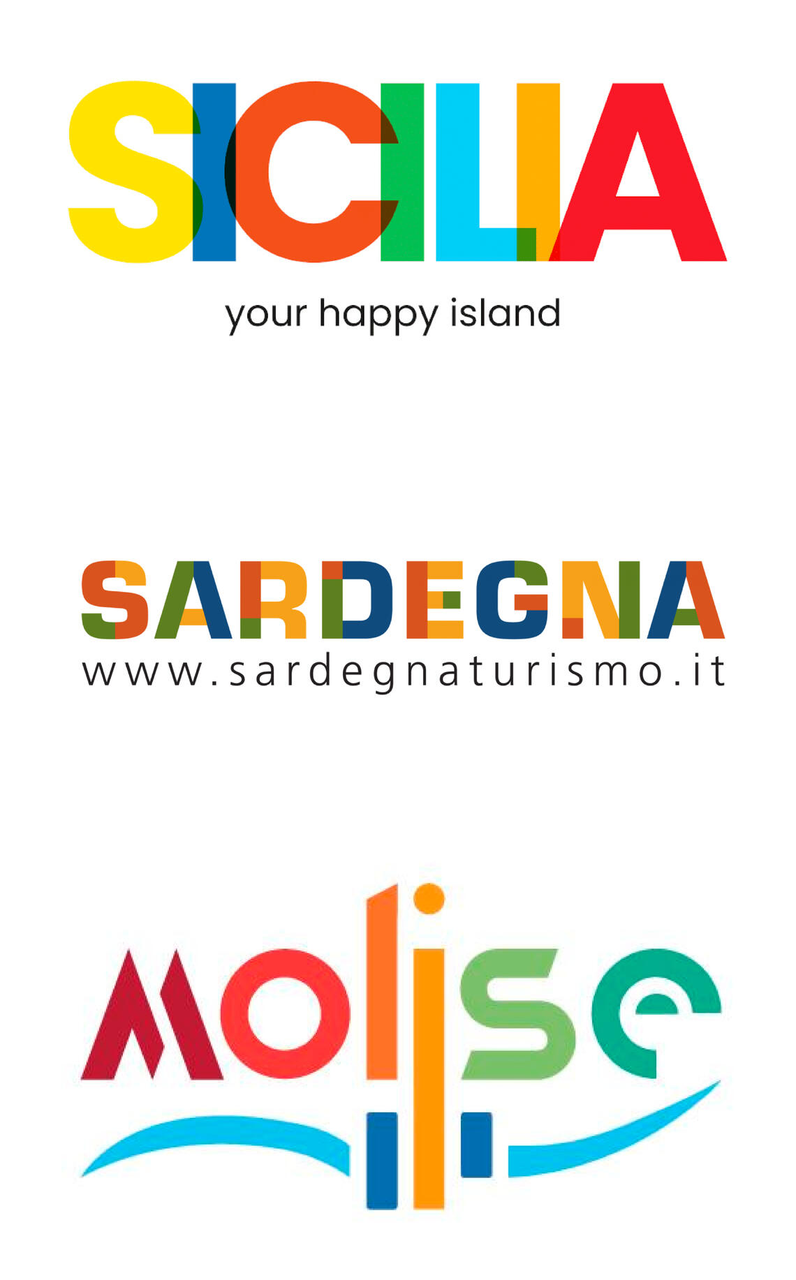
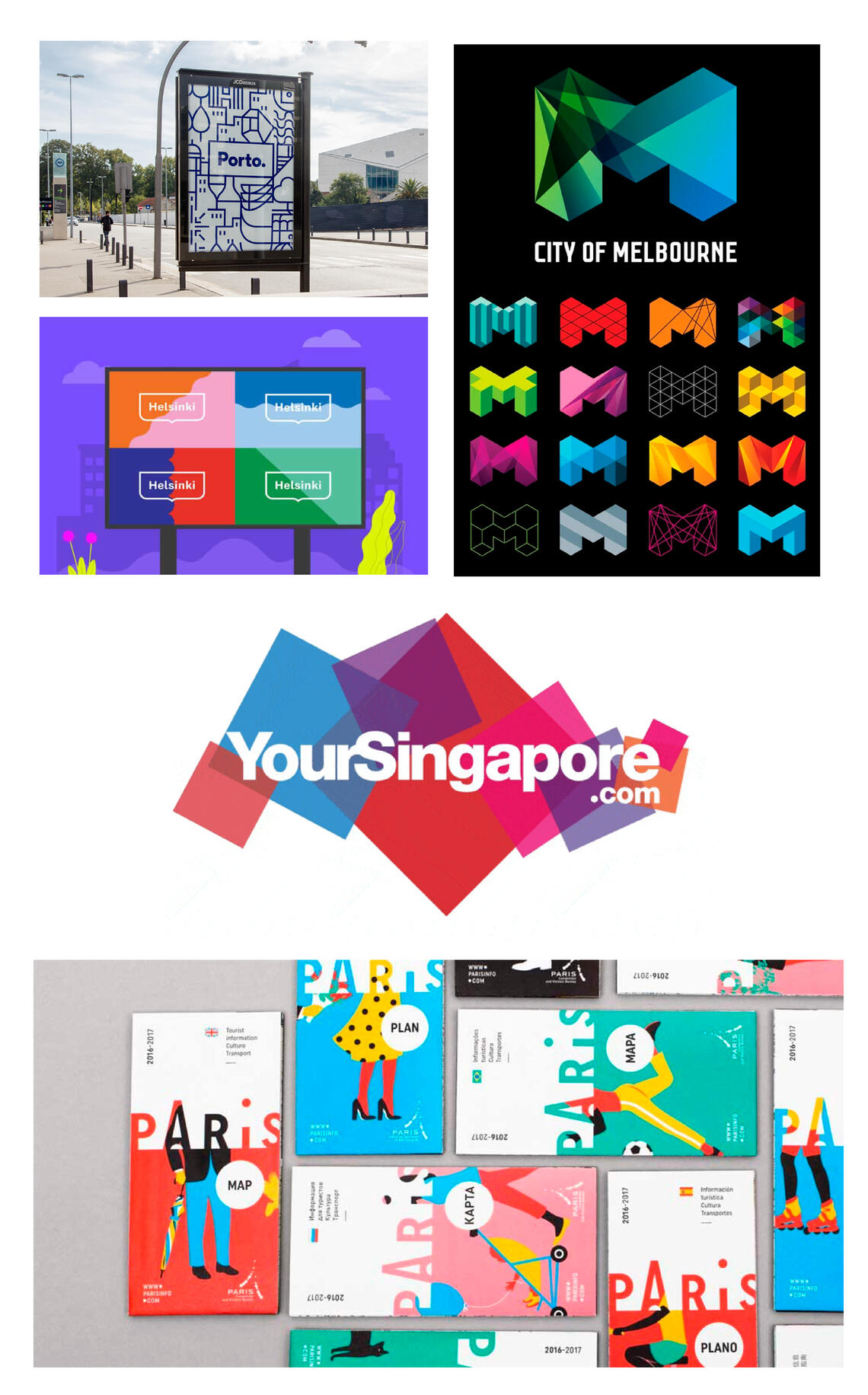
CITY BRANDING ANALYSIS
A lot of Italian cities and towns have been trying to create brands for themselves as tourism is a big part of Italy. However, there are a many brands that are using rainbow colours to represent diversity and vibrancy. This does a poor job of expressing the individual identities of the regions.A good city brand is able to express its distinct identity while remaining clear and simple. This communicates what kind of city it is with their values, culture and history. Many successful city and city related brandings feature flexible designs that can be used across different formats while still being recognisable.
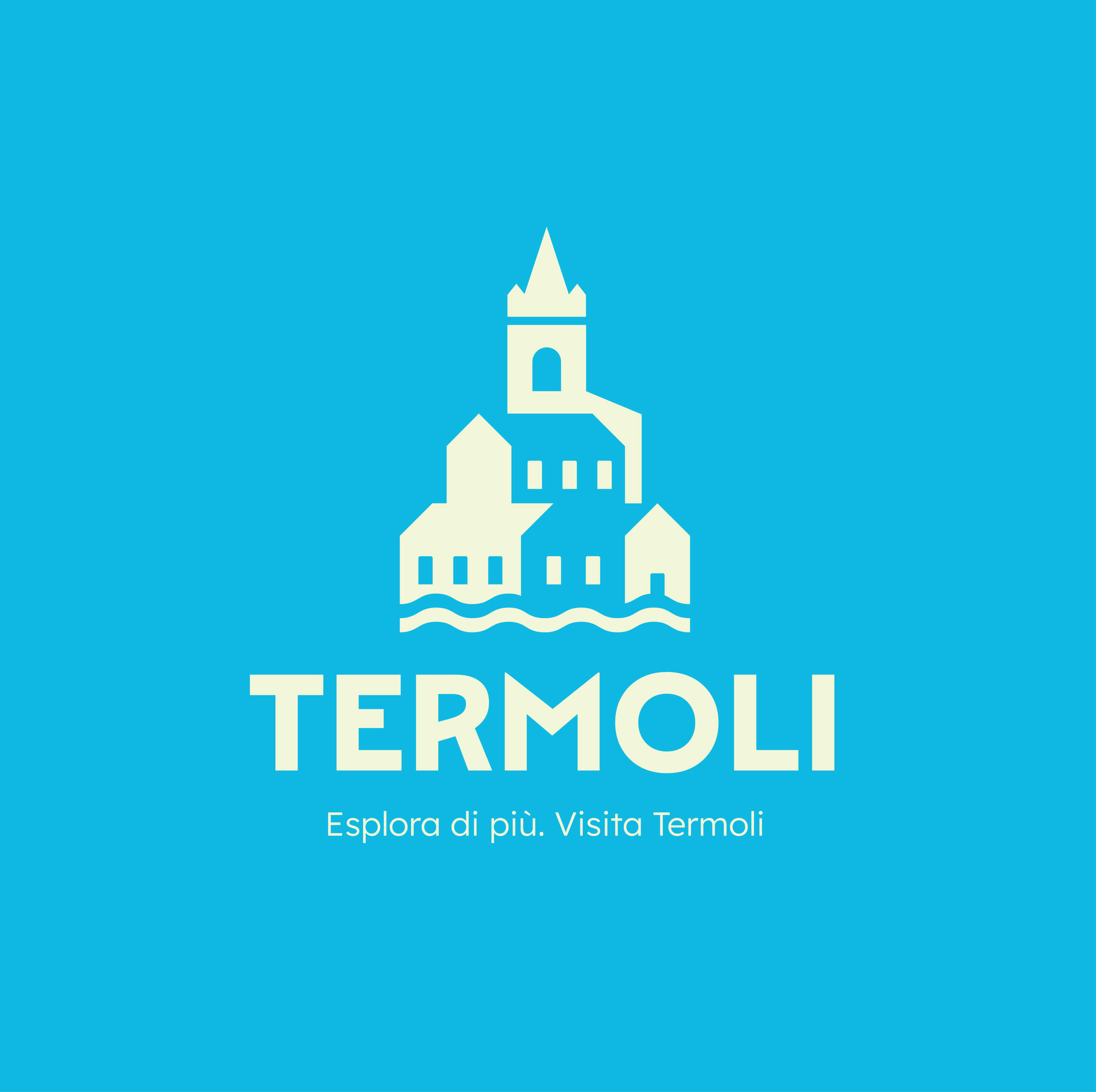
THE LOGO
The logo is comprised of three iconic aspects of Termoli’s townscape, the unique architecture, the ocean and the Cathedral of St. Mary of Purification. This creates an easily recognisable design that communicates Termoli’s sea life and historic architecture, balancing the history and the modern day. The modern style also helps connect with a younger and more modern audience.
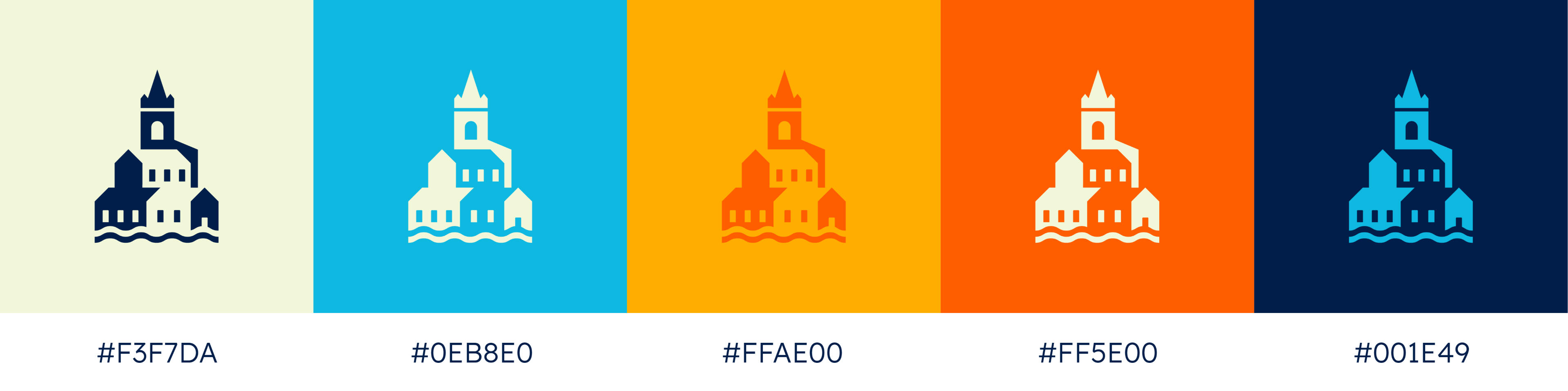
COLOUR PALETTE
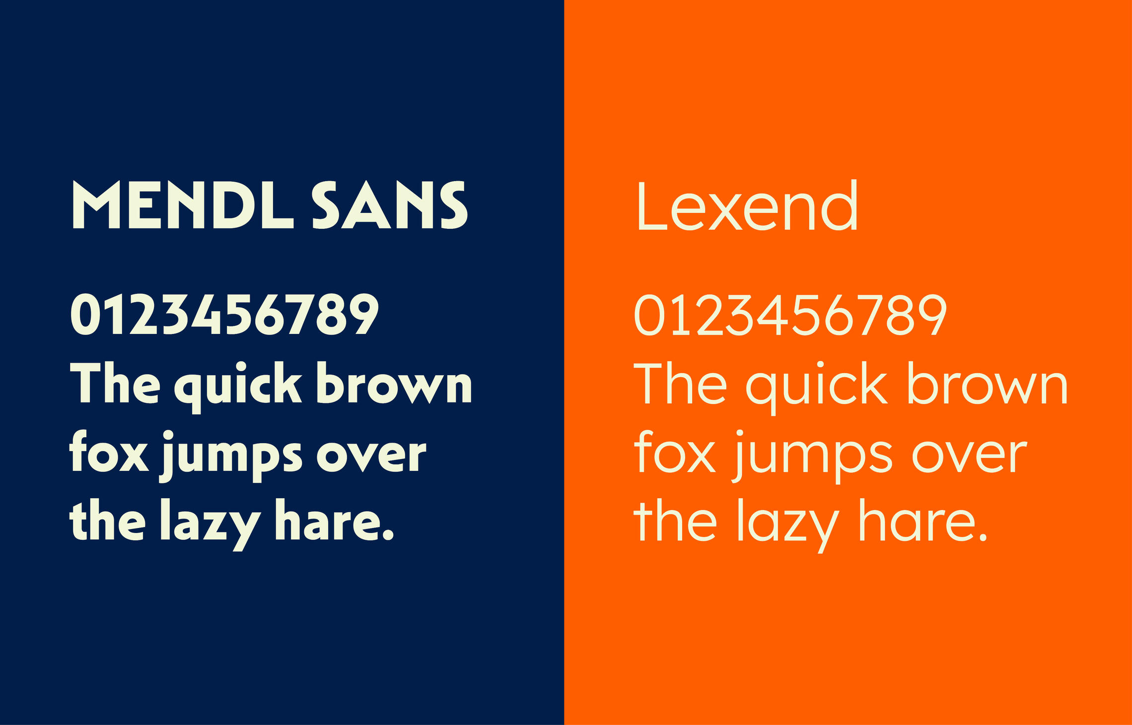
TYPOGRAPHY
Mendl Sans Dusk Bold is used as the primary font and is to be used for headers and titles. Lexend Light is used for secondary text or body text.
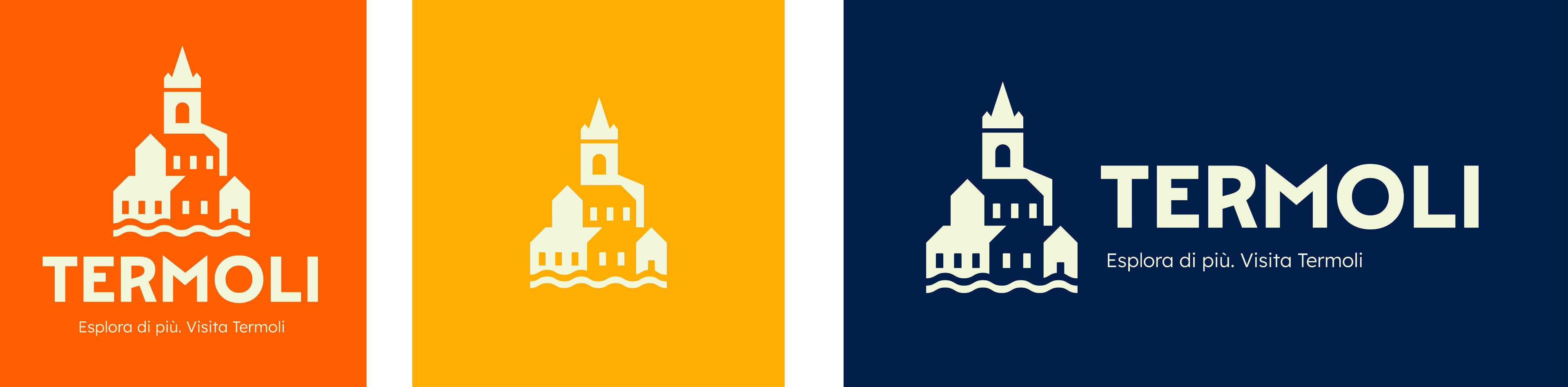
LOGO VARIATIONS
MOCKUPS


